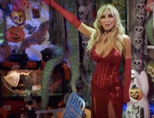
Actress Cerina Vincent has become somewhat of a Scream Queen after starring after starring in films such as Cabin Fever, Return to House on Haunted Hill, Tales of Halloween, It Waits and Freak of Nature. Just in time for Halloween season, her latest film was just released by Quiver titled That’s A Wrap. In case you aren’t familiar with the film, the description reads: “The cast of a film arrives at a wrap party, but someone has dressed up as the slasher in the movie and begins to stage their own kill scenes. One by one, the cast disappears until the true nature of the evening is revealed.” Adding to the jumps and scares is the cinematography by Marcus Friedlander, who describes the visual language as intentionally very punchy, attention grabbing and Giallo inspired. We spoke with Marcus below about the making of That’s A Wrap.
That’s A Wrap is now available on VOD.

-What would you say is the visual language of That’s A Wrap?
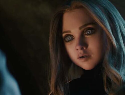
The visual language of That’s A Wrap is heavily inspired by Dario Argento and the Giallo movement, with a hint of American Horror Story: Hotel thrown in as well! We went for strong, contrasting, color washes, sprinkled with lots of Steadicam and wide angle lensing. The look is intentionally very punchy and attention grabbing, which I think works really well for a genre film like That’s A Wrap!
-One of your first meetings with the filmmakers was on the sets at Wolfpack Studios, where the film was going to be shot. I feel like this situation is reversed how it normally goes. Have you done this on any other films?
It was definitely interesting to be on set for your first meeting, instead of an office or a coffee shop, but it was actually incredibly helpful as well! Since there was very little “hypothetical” to talk about, and all that was left was the “literal”! That was a first for me in my career, but if I ever get brought in again at that late of a stage into the project, I would love to start on the stage with the director!

-How beneficial was it for you to see the sets first, then envision the lighting, ect?
It was very beneficial to see the sets built first, and then envision the lighting, because there was very little guess work or trial and error. The sets were mostly built and dressed, so it gave Marcel and I the chance to talk very specifically about colors and tones on a per sequence basis, giving us the chance to map out the film quite literally from our first meeting on. It also gave us the opportunity to feel each other out creatively, as we worked through some of the more complicated shots. When working with a director for the first time, one of the most critical aspects is learning how to adapt your style to best complement the director’s style. So having a sort of “dry run through” of some of the shots helped me realize that, luckily, Marcel and I saw things almost exactly the same way visually, and there would be no adaptation needed!
-The lighting in That’s A Wrap is pretty different than other horror films. Can you discuss what made you decide on the lighting we see?
The initial decision to light this film in this style, started with the Neon Noir creative team of Marcel, Joe, and Sarah. They conceived this Giallo-esque Meta Horror film, and I just happened to be the DoP lucky enough to get the chance to execute their vision! Once we got onto set though, it was mostly a collaboration between Marcel and I to get the look of this film just right. Usually, I’d ask Marcel for one color that defines the scene and then we’d build from there. Sometimes we would leave it at just that single color, if we wanted to be incredibly punchy. But usually, I’d take Marcel’s direction and add either a contrasting or complimenting tone to alter the mood in whatever direction the scene needed to go. Most of the time though, the goal, like with most films, was to use the unique features of the location to best emphasize the tone of a scene. For example, we had a scene in a small side room of the studio, with not much going on for it except a ceiling fan. So, we put a small brick light on each of the three ceiling blades, set one light each to Red, Green, and Blue, and turned the fan on. What it gave us was an almost carnivalesque tone as the lights moved and blended together, which I thought was perfect for the horrific reveal in that scene.
-Can you talk about any camera tricks you used while filming That’s A Wrap?
One of the most important camera tricks we used for That’s A Wrap was our use of Streak Filters to create a sense of exaggerated theatrics during the film. Marcel is a huge fan of colors and flares, but we were shooting spherical for budget reasons. So, I used a streak filter for pretty much every shot of the film, usually with a 4-foot tube right above frame so the soft light would wrap the whole mattebox evenly for a clean flare. That type of flare became the go-to language for the film, which meant, as the story called for, I’d started to play with the flare type, and the flare angle, to accentuate the drama. If we had shot anamorphic, the flares would have been 100% horizontal for the whole film (and blue unless we shot with one of the new silver flare anamorphic sets like the Atlas Orions SF’s). However, since we shot spherical lenses, with a streak filter, and here’s the critical part, in a clip on mattebox, we could spin the mattebox in order to spin the flares as well. Meaning we could angle the flares horizontally if we wanted to be “normal”, or more diagonally, if we wanted to be more “menacing”. This gave us one more story telling tool to use in our back pocket over the course of the film. And, if you look really closely, you can even see some clues in the flares!
-What was the most difficult death scene to film? Why?
The hardest death to shoot (SPOILER ALERT!!!) was probably the Psycho shower homage scene. Having such an iconic scene handed to you as a reference is very intimidating because you are walking in the footsteps of giants, so you know you have to nail it. That, plus the nudity and closed set aspect making it even tougher, led to a small, self-contained effect being much more complex to shoot than it would have first appeared. I also had to figure out what RGB tone is appropriate for an homage to a black and white film, which was a hilarious oxymoron to me. Luckily, this oxymoron afforded me the opportunity to break a cinematography rule for the best possible reason! One of the rules of RGB horror films is that you also need to consider how your lighting will affect the blood and gore from the SFX team. If your lighting is color temperature based, the SFX team will have no problem getting their work to read as “correct” on camera. However, as soon as you start doing these strong color washes, your perception of color shifts as well, and blood that was previously red, may not look red on camera anymore. So normally, you would light a blood and gore scene with either warmer HSI tones, or neutral, color temperature-based lights. However, if you light the scene with strong blue tones, it washes out the red from the blood and makes it look like black sludge instead. So normally I have to avoid that side of the color wheel for big effect scenes. However, that desaturated look for the blood was EXACTLY what we wanted for this particular homage, and it made logical sense for the bathroom to be washed in cooler tones as well. So not only did it help create the homage look we were going for, but it also allowed us to explore a new color scheme for the film, creating an even more diverse palette!

-That’s A Wrap is advertised as a giallo-esque horror/thriller. Did you and the director talk about wanting a Giallo look before filming? What did those discussions look like?
Marcel and I talked extensively about the look of the film prior to shooting, almost exclusively about what a Giallo film really is, and how to best replicate it. Luckily both of us were incredibly familiar with the genre before the film started, so it was less a process of discovery, and more a process of refinement. After discussing color palettes, we talked extensively about the various elements that make up the Giallo sub-genre and where we could sprinkle those into the film. We also looked at references using ShotDeck.com, which I think is an absolutely brilliant website for discussing film references with other creatives!
-What did you learn from That’s A Wrap that you will apply on other films?
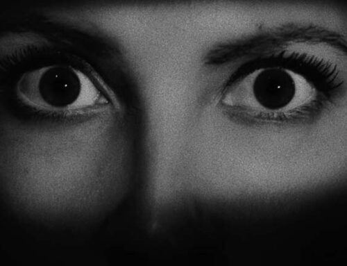
That’s A Wrap was the first time I’ve lit a masked face extensively, and it was a major learning experience for myself, that I’ve already applied to a couple films since! I’ve always been a huge fan of eye light, but I learned how critical it is to work with the actor behind the mask in order to really get their eyes to pop. Working with our actor, we would not only land marks on the ground, but also give the actor marks for their chin direction and eye direction as well. We found that with a chin halfway pointed down, and the eyes flicked up, we could make sure Mistress’ eyes popped out of the frame. Masks can photograph so flat if you try and light them like a human face. But if you instead treat the mask, and the human eyes behind the mask, as separate elements, you can create some really magical moments where the audience connects with the eyes of the killer, especially on closeups. For me, feeling the power from the eyes is the difference between looking at a human behind a mask, and looking at something that might as well be a puppeteered mannequin.
You can learn more about Marcus at https://www.marcusfriedlanderdop.com/.

