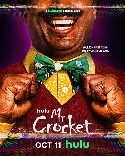
It’s that time of year again, Hulu’s Huluween is back! This year there is a lineup of debuts, including FX’s Grotesquerie, the return of American Horror Stories, Hold Your Breath, and Carved all streaming for the first time on Hulu and Hulu on Disney+ for Disney Bundle subscribers. Another new original film premiering is Brandon Espy’s Mr. Crocket. The film’s synopsis reads: “In 1993, a mysterious children’s show host, Mr. Crocket, magically emerges from television sets to kidnap young children, brutally slaying their parents in the process. After Mr. Crocket snatches her son, one determined mother embarks on a perilous quest to track down the demonic entertainer and rescue her boy.”

Photo by Charlie Gray
To recreate the perfect 90’s look for the film, Brandon brought on cinematographer Powell Robinson, who also worked on Appendage, which premiered last year as part of Huluween. When discussing the film’s style Powell says, “Brandon very much wanted to draw on the 90’s dramas of that era like Menace II Society and Juice and use those as our base line to establish a new look for this horror world.” Powell breaks down the creative process for making Mr. Crockett in the below interview.
Mr. Crocket is available to stream now on Hulu.
First off, what attracted you to the Mr. Crocket script?
I loved that it was an ‘80s tone franchise horror movie set in the ‘90s. Those two time periods, while they are so close in time, are also very distinct in their looks. It was fun to come up with a movie that still had to feel like a modern horror movie, but with a ‘90s aesthetic that made you feel like you were watching a classic Nightmare on Elm Street style movie. It was a crazy blend of elements to try and manifest.
What was preproduction like for you on Mr. Crocket?
Fast and furious. We only had two weeks of hard prep in New Jersey. Luckily, Brandon and I live in LA, so were able to meet up prior to that and go through his shot list. Once we got out there, it blazed by. A lot of it was spent figuring out how to utilize our stage space the best way because we had many practical locations, but we also had the Mr. Crocket’s World standing set that was one of our biggest lighting rigs to accomplish which had to share the same stage floor as one of our interior house builds as well.
There would be no significant change over /re-rigging time to go from happy Crocket world to hell world, so we needed to figure out a way to utilize the same overhead lighting set up for both, but have them feel radically different.

Many critics have said Mr. Crocket is the horror version of Pee-wee’s Playhouse and Mister Rogers. Do you agree with this? Did you visually try to shoot parts of the film like those programs?
I would say he is Mister Rogers and Freddy Kreuger put together. From the beginning, the conversation was the show needs to feel authentic. If we hadn’t gone through the effort to make lit it like that era of a broadcast show, hadn’t lensed it the same way on zooms, hadn’t moved around on the floor loosely like they did on broadcast tripods, it wouldn’t have worked. We tried to apply the same principles to the gear we had to get as close to the on-set experience they had back then for shooting those shows. Then we ran the footage through a processing system that basically got it as close as possible to what finding a weird hidden vhs tape of the Crocket show would have looked like. We took our set footage and had colorist Jared Rosenthal place a 70’s film emulation on it, then ran it through a crt analog remastering process during which we filmed an old crt tv and manually created all glitches that distort the show by hand with custom analog glitch boards (all handled by Danny Erb at Circuit Bent TV). The end result, when you take the footage of filming the crt tv with the Crocket show and comp it onto one of the tv plates we shot on set with the kids, it feels like you’re watching real archival footage.
Mr. Crocket is part of this year’s Hulu’s Huluween event. You also had a Huluween film last year, Appendage. Is this just a coincidence or was it with the same team?
The executive producers at WorthenBrooks really liked the department heads for Appendage, so they reached out to a bunch of us to come to the next one: Michelle Patterson who was the production designer, Naomi Wolff Lachter who was the costume designer and Alex Familian who was the editor. We all have such a good working relationship already, it was a seamless experience getting to hop back with a very similar team and make another one.

What is it about these darker horror films that attract you?
I love lighting for contrast and amplifying drama and emotions through contrast, as well as playing with under and over exposure in ways that don’t always work for comedies or strictly dramas. I would love the chance to apply this to sci-fi and fantasy as well, but horror is a really fun playground for me to just light what feels right and experiment with.
Do you have a say at all in location choices? For instance, the funeral church scene with light coming through the windows was shot perfectly. I imagine you would be able to tell up front it would photograph beautifully.
The church was a fun challenge. I knew it would be a great location to shoot, but the sun travels on opposite sides of where we decided to put the light coming through. We knew that the light was going to move so much, that we timed it to where we didn’t have any direct sunlight coming through any of the windows at all and lit the whole church ourselves from one side with a bunch of Creamsource Vortex’s and HMI’s, so it stayed consistent for all the coverage at the brisk pace we had to shoot it at.
Unfortunately, on a movie of this size I don’t have much of a say in the locations, you just scout what you are given. I can suggest the best time to be there. I can suggest that we don’t do things in one location that we could pick up elsewhere, but what it comes down to on a movie this scale, is finding the best ways to utilize what is available to you.
Visually, how was Mr. Crocket different than other films you have worked on before?
Luckily, I have been able to choose projects where I never have to repeat myself. I like giving each film its own world to live in. It’s way more fun to have a filmography of movies that all feel like how the movies want to feel and not how I want them to feel. That was the fun part about Crocket, I’ve never shot anything that was set in the ‘90s. I’ve done some ‘80s and 70’s stuff, but the ‘90s was a very distinct period and Brandon very much wanted to draw on the ‘90s drama look of that era from films such as Menace II Society and Juice, and use those as our base line to establish a new look for this horror world.
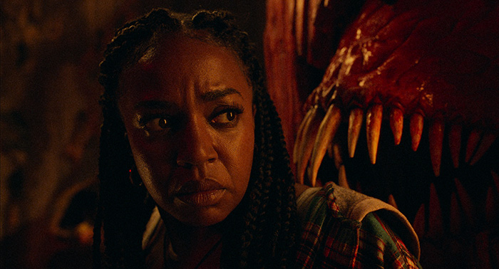
It was also new because I got to play with so much color because of Mr. Crocket and the character he is. It was a totally new look to get to bring to horror. Often horror is muted, but with this one we got to crank it up to 11. There are scenes where there is pitch perfect red on screen against fiery orange, then you have the ‘90s vibrant blue moonlight coming into other bedroom scenes. I jumped at the chance to bring that level of saturation to a horror movie because I don’t know when that opportunity will come again. Finishing Colorist Damien Vandercruyssen really brought the palette together with his grade on the film, and made all our wacky choices feel unified and live under the same roof.
The coloring in the final sequence is very vivid with reds. How did you achieve this look?
It was a mix of two things. We had a soft box built over the middle of the set that was basically replaced with CG later, where they turned it into the hole in the ceiling that looks out into the hellfire sky of Crocket’s nightmare world. We stuck a bunch of LEDs in there that could generate a perfect primary red for me in the middle of the room. We always had that on at a slight low ambience level so that even though we weren’t always shooting on that side of set, the world had a constant undertone of red.
Tying back in with what I said about lighting Crocket world with the same lights, all the tungsten units that were used to light the Crocket show itself were the same ones we used for hell world, except they were run through a rat pack dimmer that my gaffer would control from his iPad. He could set all these tungsten units to dim and oscillate in crazy ways and when you dim low on tungsten units, they get warmer. So in camera, we white balanced way to one side where these already warm tungsten lights now play even more orange (camera was balanced around 7000 Kelvin). These tungsten lights felt pure gold, and mushed with the red into this very warm, dense bizarre palette. Damien had a playground of weird colors in there to work with once we got this to post.
