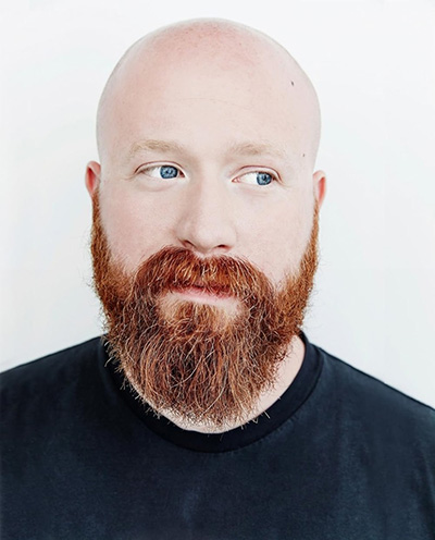
 I recently connected with acclaimed horror editor/producer Josh Ethier, ACE, who most recently cut together Adam Schindler and Brian Netto’s Netflix horror-thriller Don’t Move. The film follows a woman named Iris, who must fight for her life after a killer injects her with a paralytic agent. As her body begins to shut down, the stakes of her survival grow taller and taller. Ethier was therefore faced with a unique challenge in editing Don’t Move. How do you convey emotion and momentum without the aid of your protagonist’s own physicality?
A close collaborator of indie horror filmmaker Joe Begos, Ethier is already attuned to the nuances of performance that any great editor must pick up on, so this careful attention to detail proved especially crucial on Don’t Move, as he examined actress Kelsey Asbille’s eyes and facial expressions across every take. He spoke to me about his creative process on the film, as well as his larger creative philosophy for the horror genre and beyond. Ethier also teases his next project, the highly anticipated Companion, which he co-edited alongside editor Brett W. Bachman, ACE. The film is slated for release on January 31, 2025.
Don’t Move has a really unique premise, with the protagonist, Iris, being paralyzed and having to rely on her mind rather than her physical body to survive. How did you approach editing a film where the main character is essentially immobilized for most of the story? What kind of challenges did that present for you in terms of pacing and building tension?
I got very lucky in that Kelsey Asbille was cast in the role of Iris and completely understood the assignment. She always stayed within the boundaries of her condition, and did as much as she could with what she had. For a big portion in the middle of the film, that’s just her eyes, and she leaned on them heavily. As an editor, I’m used to closely investigating the human face to land emotional beats, but Don’t Move brought that skill set to an entirely new level. Thankfully directors Adam Schindler and Brian Netto knew that we’d need lots of performance to paint with in editorial, so they always made a little extra room for Kelsey’s performance, really giving her room to shine.
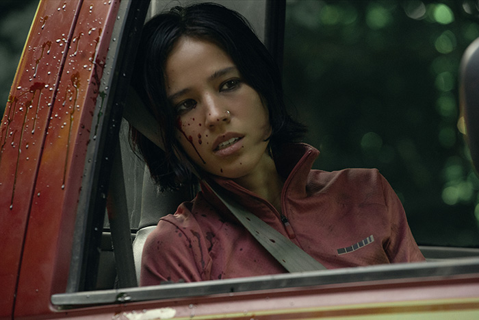
The film relies heavily on lead actress Kelsey Asbille’s eyes and facial expressions to convey fear, panic, and determination. Can you talk about how you approached the editing to highlight these subtle details? Were there any specific moments where you felt her performance and your editing choices really heightened the horror?
The sequence that I think highlights it best is the section where she’s lost all mobility and the film basically hands off the narrative to a stranger that finds her paralyzed on his property. She can’t really convey any information to him so he has to jump to a lot of conclusions and make decisions on his own. Then when the killer shows up to reclaim her, it becomes a delicate balance of, “Will he or won’t he believe him?”
All the while, Iris is stashed in a safe place watching everything unfold, using only her eyes to convey hope, dread, fear…everything. That was the scene that I loved most in the script, and the one I patiently waited for during production. I’m really happy with how it came out.
With so much of Don’t Move taking place in a single location and centered on one character’s struggle, how did you balance maintaining a sense of urgency and kinetic energy without the usual fast action or movement in a typical survival horror film?
I think a lot of that falls on our Director of Photography Zack Kuperstein’s shoulders. He had such an eye for shooting small spaces cinematically. So I was able to really drill down the coverage to underline certain moments. Using “dirty” coverage for Richard (to highlight his proximity), but then using “clean” coverage for Iris (to highlight her loneliness). Or having traditional coverage for the cabin sequence and then suddenly we’re jumping to profile shots as things escalate. Being sparing with shot selection can help you keep things fresh when things are really contained. Being selective with trims can also keep things moving. Adam and Brian were happy to keep anything that worked but were also open to trimming things that bumped pacing, because we all innately understood that would be a big hurdle for us with an immobilized protagonist.
This film strips away a lot of the physical horror elements we might typically see in survival thrillers. How did you make sure that the horror was still present and impactful without relying on those more traditional visual tropes (like gore or physical combat)?
I think instead of the traditional physicality of a genre film, we had to lean more into the dread and tension of Iris’ experience. This helped us to keep it more in the world of a character piece rather than a traditional survival film. Leaning into those moments where the violence is sudden and shocking really helped us to dole out the dread and atmosphere in between.
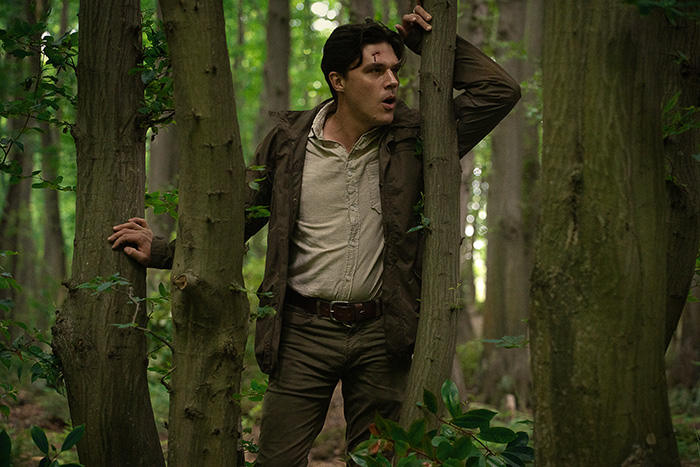
In horror, editing often plays a huge role in how scares land, especially when it comes to timing and pacing. What is your approach to editing a jump scare, if it fits the tone of the film? Are there any examples from Don’t Move where you used editing to heighten those moments?
I think the approach should always be to look at the footage and see what the strengths of the moment are. If you need to use a cut or a loud sound to get the scare, so be it, but it’s not my preferred method. I’d much rather get an audience to lean in for it and surprise them in some way. We didn’t have a lot of opportunities for that in Don’t Move, so we tried to do something fun with the few that we did have,like making sure the audience knew that Richard was dazed after the crash, so when he suddenly springs to grab her it was a bit more shocking.
What was it about the script for Don’t Move that drew you in? Was there something about the horror elements or the emotional core of the story that particularly spoke to you as an editor?
I loved the challenge that the title of the film presented, and I really connected with the directors when we first met to discuss the film. As a fan of downer cinema the setup spoke to me. Iris’ transition from a person who’s lost everything to someone who’s found something to live for is a difficult trajectory to land, and I love being challenged because that’s where you can find growth as an artist.
How does your experience editing horror films inform your work on other genres or projects? Do you find yourself using the same tools in other films, or do you intentionally shift gears when editing outside of the horror realm?
I think the lessons you learn as a horror filmmaker are useful in any genre of film and it’s unfortunate some folks don’t get a chance to express those skills in other genres. I’ve been lucky to work in a number of genres, be it horror, sci-fi, thrillers, comedies. I never feel like I have to change gears because the only gears I have are my own and they’re informed by the films I’ve made, the films I watch, and the life I’ve lived. So I embrace that whenever I’m handed a scene and I try to make it uniquely my own.

What can fans expect from your upcoming film Companion? How did working alongside co-editor Brett W. Bachman impact your approach to the editing process?
Companion is such a great audience film, and I’m glad that New Line and Warner Bros. are giving it a big theatrical push. Working with Brett is a dream come true as we’ve been friends for a long time. I’ve always admired his work and getting the chance to work with him on something was really special. I feel we’re both talented editors but also totally different people and on Companion that comes through beautifully. All of our strengths shine through in the edit. The movie has such a specific voice, I think folks would be hard-pressed to pick out which scenes were cut by whom and I think that speaks to our strengths as conduits for story. Hopefully I get the chance to work with him again; it was a real highlight for me.
