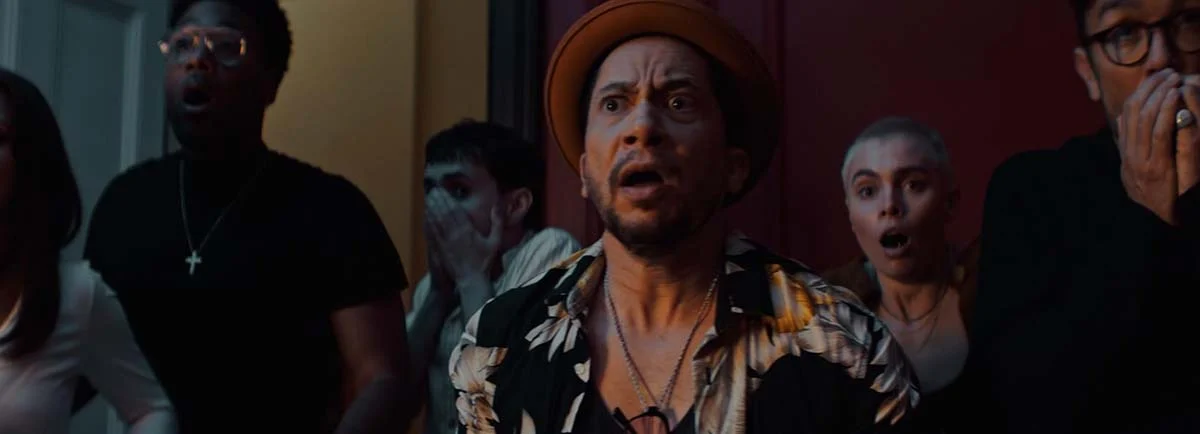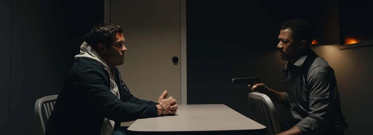
A stranger appearing on Charles’ doorstep sets off a chilling chain of events in Hulu’s new thriller, The Man in My Basement, starring Corey Hawkins and Willem Dafoe. The official synopsis reads: Charles Blakey, an African American man living in Sag Harbor, is stuck in a rut—out of luck and on the verge of losing his ancestral home—when a peculiar European businessman named Anniston offers to rent his basement for the summer. The film made its debut at the 2025 Toronto International Film Festival, where critics praised many aspects of the production, including the meticulously crafted production design by Kathrin Eder. Some of Kathrin’s previous credits include The Night House and Hellraiser (2022). When discussing The Man in My Basement, Kathrin says, “With this film, so much of it lives in the psychology of the characters, so the design needed to echo that. The house itself became a character, layered with Charles’ family and community history, filled with objects that carry memory, but also filled with absence and forgotten-ness.” Kathrin talks about working with director Nadia Latif, what the horror genre means to her and much more in the below interview.

Production designer Kathrin Eder
Jordan von Netzer: How did you get connected with The Man in My Basement?
Kathrin Eder: I got the script through my agency. My agent set up a meeting with Nadia, the director and we connected over our conversation about the design of the film.
JVN: Horror often relies on setting as much as characters. How did you design the basement to feel unsettling the moment the audience sees it?
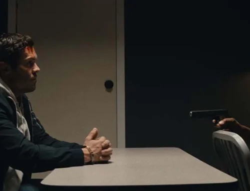
KE: The basement was jarring to design. I knew we would be spending a large part of our story within these walls, and there was a visible arc to the space from beginning to end. Nadia and I had a few months to meet weekly and break down the emotional beats of the script, and by doing so we answered a lot of questions that the basement naturally posed. We started playing around with a 3D model, changing the size, the layout of the stairwell, the story-space underneath the house, wall textures, and the placement of the cage.
The space goes from a dark and forgotten place filled with generations of family life to a space emptied for a strange visitor. As a surprise, the visitor turns the basement into a place of his own redemption—until the owner of the house reclaims it as a space of reflection, growth, and solitude.
It was a challenge to make a box interesting enough. The collaboration with our director of photography was crucial to keep it compelling through lighting and camera positions.
JVN: Did you play with spatial distortion—narrow hallways, low ceilings, strange angles—to make viewers feel trapped?
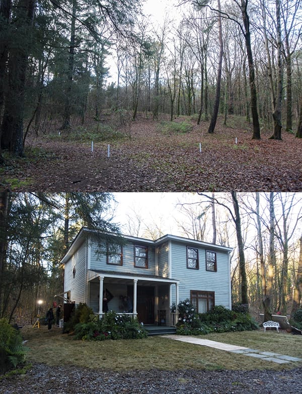
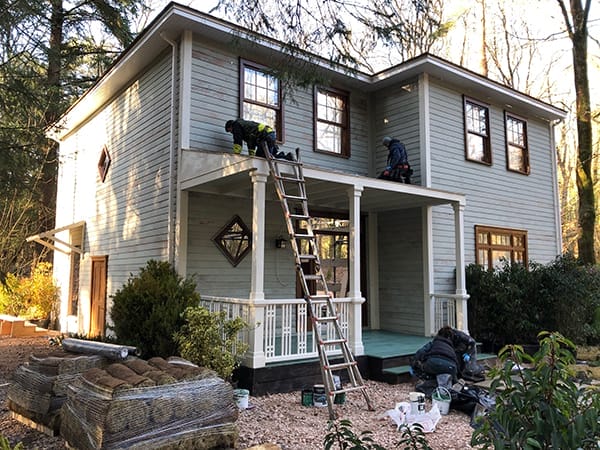
KE: I like to ground design in realism and authenticity. For this project in particular, we felt it was both necessary and beneficial to anchor the story in spaces that felt lived-in and true. Even though we took some liberties with the style of the house and its strict architectural accuracy, our focus remained on shaping it as a reflection of the family who inhabited it for decades, and of the community it stood at the center of.
The house wasn’t built small or with odd angles, yet I leaned into creating spaces that offered narrow glimpses into other rooms—fragments rather than full views. I played with shadows that naturally pressed certain corners into darkness and shaped silhouettes that lingered like echoes from the past. Charles is, in many ways, trapped by his choices—or by his inability to make them—and if that sense of entrapment found its way into the very design of the space, then I am happy.
JVN: How did you use contrast between the “normal” domestic spaces upstairs and the horror inflected basement below?
KE: Upstairs, the house had to feel familiar and domestic. The spaces are lived-in, layered with family history, and carry the comfort of routine it once had. I leaned into warmth, softer light, and textures that felt approachable and human, and were meant to isolate Charles even more in his loneliness and depression. It was important that the audience could recognize themselves in those rooms, to feel that this is a real home. And a home life was missing in.
The basement, by contrast, is meant to strip that feeling away. It begins as a forgotten space, heavy with shadows and dust, and gradually transforms into something more unsettling. I think it’s mostly the behavior of the 2 humans in the space that create the mood, more than the material world around them. I did enjoy the descend into an ascend from the basement as a metaphor. The vertical axis is a tool I really enjoyed applying here. Where the upstairs connects or connected people, the basement isolates them. That shift in tone and atmosphere allowed the basement to hold the horror elements, I think, while still remaining believable within the world of the house.
JVN: How closely did you collaborate with the actors to ensure the sets supported their performances?
KE: Corey and Willem were definitely kept in the loop on all our builds, and Willem had input on the cage and its furniture, which was great.
JVN: Horror has a long visual tradition—did you draw inspiration from other films, or try to subvert expectations of what a “horror basement” looks like?
KE: I’m drawn to realism, and I like to ground spaces in reality. For me, exploring a character’s backstory is essential—it reveals so much about the geography, the economy, and the rhythms of a space. And in turn, those spaces quietly inform the audience about who the characters are.
I was never a fan of horror at first, but through working with directors like David Bruckner, a door opened for me into its possibilities. Horror gives you tools to explore themes that are difficult for the human experience to digest. It allows stories to unfold in ways that are both vulnerable and experimental—where fear, grief, or conflict can be transformed into something visual and visceral.
My inspiration shifts depending on the story—sometimes it comes from history, sometimes from nature, sometimes from art or anthropology. Each project asks for something different, and I love following where that need leads.
JVN: How did your collaboration with the director and cinematographer shape the horror aesthetics of the set?
KE: We discussed everything and tried to make as many decisions together as we could. Nadia and I had a head start with a few months to work through the backstory and our hero sets, which gave us a strong foundation. Once Ula joined, the process became very collaborative. We vetted each choice about space, light, and texture together and made some augmentations based on what would work best for each moment of the story.
I like how our collaboration really shaped the aesthetics of the film. Nadia has a strong sense strong of character and space, and Ula translated that into how the camera embraced shadows, how tension could build visually how we moved through the spaces. I tried to design environments that could hold all of that, spaces that felt grounded in backstory, but flexible enough to let light, shadow, and camera movement create unease. I like the outcome. We were able to find that balance between realism and the unsettling atmosphere the story demanded.
JVN: Were there discussions about how much to “show” versus how much to let sound, shadow, and suggestion carry the horror?
KE: Our composer Rob brought such an incredible sound-sphere to the story, and I was surprised by how much it carried the visuals. Some of the sounds were written into the script, like the scratching of the uncle’s fingernails upstairs, and those moments where discussed strategically and directly influenced the design.
For Nadia, it was also very important that we “visually” controlled how sound traveled from the basement, when it was heard and how far it carried. A lot of the horror came from that balance between sound, suggestion and silence, not just from what we put on screen.
JVN: What textures or materials did you choose to enhance feelings of rot, decay, or unease?
KE: I think it was about forgotten-ness. Items discarded rather than cherished, not used rather than touched. Just like Charles. I wanted that stillness to create that texture. A deeply lonely and forgotten person surrounded by things so rich in history, community, and integrity. That contrast creates tension and pain. That was the main goal, and everything was built on that.
What excites you most about production design as a form of storytelling, especially in a psychologically driven film like this?
KE: What excites me about production design is that it lets me ground stories in spaces that feel alive. I love pulling inspiration from reality: a character’s backstory, the geography of a place, or the textures of daily life. Those details tell the audience who these people are, often without a word being spoken. I enjoy when design becomes part of the invisible language of storytelling, where you’re shaping not just what’s seen but what is felt.
With this film, so much of it lives in the psychology of the characters, so the design needed to echo that. The house itself became a character, layered with Charles’ family and community history, filled with objects that carry memory, but also filled with absence and forgotten-ness. In contrast, the basement had to reflect something darker: a space of fear, tension, and emptiness and conflict. It was about finding ways for the architecture and textures to mirror the emotional states of both the characters and how they change. I hope the audience was able to feel the story in the spaces around